
Building a Universal Design System
A scalable design system for consistent design across multiple projects, with a focus on atomic components and design tokens.

Overview
In late 2024, I was tasked with a challenge of designing a comprehensive design system that could accommodate multiple projects. As the sole designer working alongside a product manager and two developers, my goal was to create a foundation that could evolve from supporting an MVP to potentially becoming the backbone of a SaaS product.

My Role
Design System Designer / Product Designer

Team
1 PM, 2 Developers, and myself as the sole Designer

Tools used
Figma

Year
2024–2025
Context & The Challenge
I wanted to create a design system that was not just a set of pretty colors and buttons but a living, breathing framework. It needed to be scalable, accessible, consistent, and a breeze to iterate on - all while keeping things light and speedy for that crucial MVP stage. I teamed up with our PM to nail down the requirements and ensure we were building something that would serve us now and in the future.
Principles
To keep us on track, I set these core principles as our north star:

Accessible
Aim for compliance with WCAG 2.1 guidelines, ensuring all components meet contrast, readable type, and general accessibility standards.

Atomic
Build components from smaller “base” parts (unpublished building blocks) so we can easily expand a component’s scope later without breaking anything.

User-Friendly
A system that is intuitive for both internal teams and end-users.

Efficient
Focus on must-have elements first. During MVP development, shipping quickly was more important than an overly complex library.
Approach / SOPs
My process involved close collaboration with our PM, who set up tasks for each needed component or design pattern. I then reviewed those tasks to spot overlaps or potential redundancies. To keep the library lean, we used specific evaluation questions before approving a new component:
What existing component(s), if any, can already serve this purpose?
Is this new component likely to be reused and scalable across multiple projects?
Will it remain compatible with existing tokens and patterns?
Is it straightforward enough to develop without introducing unnecessary complexity?
This approach helped us avoid bloating the system with redundant patterns.
Tokens & Variables
Tokens were the backbone of the system. Tight timelines meant we would probably need to iterate in the future as the system would grow and we would gather feedback from our clients and their users. By mapping primitive values (e.g., colors, scale) to semantic tokens, I created a structure that was easy to update and maintain. For example, if the primary brand color changed, I could adjust a single token, and the entire system would update automatically.
Here’s how tokens were structured:
Primitives: Our most basic level - core color palettes and a number scale.
Semantic/Mapped Tokens: Color, Spacing, Typography values which reference primitive values. E.g.,
--surface-brand-primary,--content-brand-primary. Updating a single token updates the entire system automatically, making the iteration process seamless for both Figma-based designs and code implementations.Component-specific Tokens: Additional groups for components, handling variations like states, sizes (small, medium, large), or modes (desktop vs. mobile). The component-specific tokens referenced the mapped values for spacing.
Apart from mapping variables within the Figma "backend", I also created quick info sheets in Figma to visually document how tokens are meant to be used. This lets collaborators see, at a glance, what each token references and where its meant to be applied.

An example of how the tokens are mapped - here it's sizing properties.
Foundations
I saw the fundamental “building blocks” of the system—including color, spacing, typography, and effects—as the bedrock for everything else.
1. Color System
I designed an accessible and versatile color system based on functional needs, avoiding unnecessary additions, with a room to grow in the future. These were the key points:
Primitive Colors: Foundational palettes for grayscale, brand, state colors (blue, red, green, yellow), etc. Created palettes with tints.dev.
Tints & tonal ramps: For each color (e.g., brand pink), I created multiple tints (50, 100, …, 950) to handle different states or contexts. This naming system allows to add in-between shades if needed, eg. 125, 150 etc.
WCAG 2.1 Compliance: Tested each color combination for contrast in typical use cases (e.g., text on white).
Semantic Mapping: Mapped brand or state colors to semantic tokens (like
--surface-brand-primary) so that if brand pink changes in the future, developers only need to update one place, and everything else follows.

Solutions & Highlights
Spacing, Radius, and Border
For spacing, I I combined two approaches:
4pt Grid System: I used a 4px base grid for spacing, allowing for precision in components like buttons where visual balance is crucial (e.g., 24px on the text side and 22px on the icon side). Smaller increments, like spacing-0.5 for 2px, provide necessary granularity.
T-Shirt Sizing: For static elements like borders and radii, I used a T-shirt sizing approach (e.g., sm, md, lg) to keep the system simple and lean. This method is sufficient because we rarely need sizes "in between" predefined values, such as a radius or border between Medium and Large. If a new size is needed in the future, it can be added using a consistent naming pattern.
I converted pixel values to REM in the token definitions, helping with responsive scaling and accessibility. If a user changes OS-level font sizes, the UI adapts accordingly.

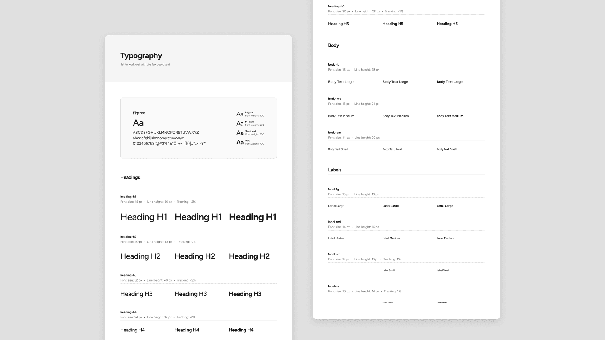
3. Typography
Variables: Set up families, weights, sizes, and line heights in Figma, all referencing tokens for easy updates.
Google Font Figtree: A versatile, modern sans serif. If needed, we can sub in another sans serif while maintaining the same line-height/size ratios.
Type Scale: I used the Typescales plugin in Figma to generate a consistent scale. Started with a 1.25 ratio from a 16px base, then fine-tuned it to align with our 4px grid. This ensures heading, body, and label definitions are consistent and always look intentional.
Effects
Finally, I added a modest set of shadows and blurs. They’re all token-based and minimal in usage, preventing the interface from looking cluttered or heavy. If a future project demands more dramatic styling or a “flat” aesthetic, we can tweak the token values without destructively editing every single instance.
Once the foundations were solid, I built out a library of components using a consistent approach:
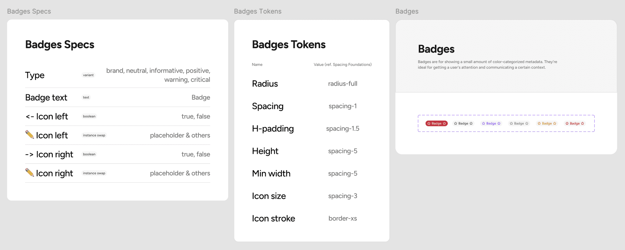
Specs & Variables
Each component has either some or all of the following:Variants (e.g., button type: primary/secondary, or state: default/hover/disabled).
Boolean properties (e.g., toggling an icon on/off, enabling hint text).
Instance swaps for nested icons or sub-components (e.g., a modal’s default body can be swapped for different content sections).
Text properties to easily update labels from the component panel
Atomic / Modular Structure
For complex, larger components (like tables), I built unpublished “sub-components” (table headers, cells, etc.) that combine into a main “table” component. This keeps things flexible. For instance, if an upcoming project needs a special cell type for an icon label or progress bar, we only need to modify or add that sub-component rather than rebuild the entire table.
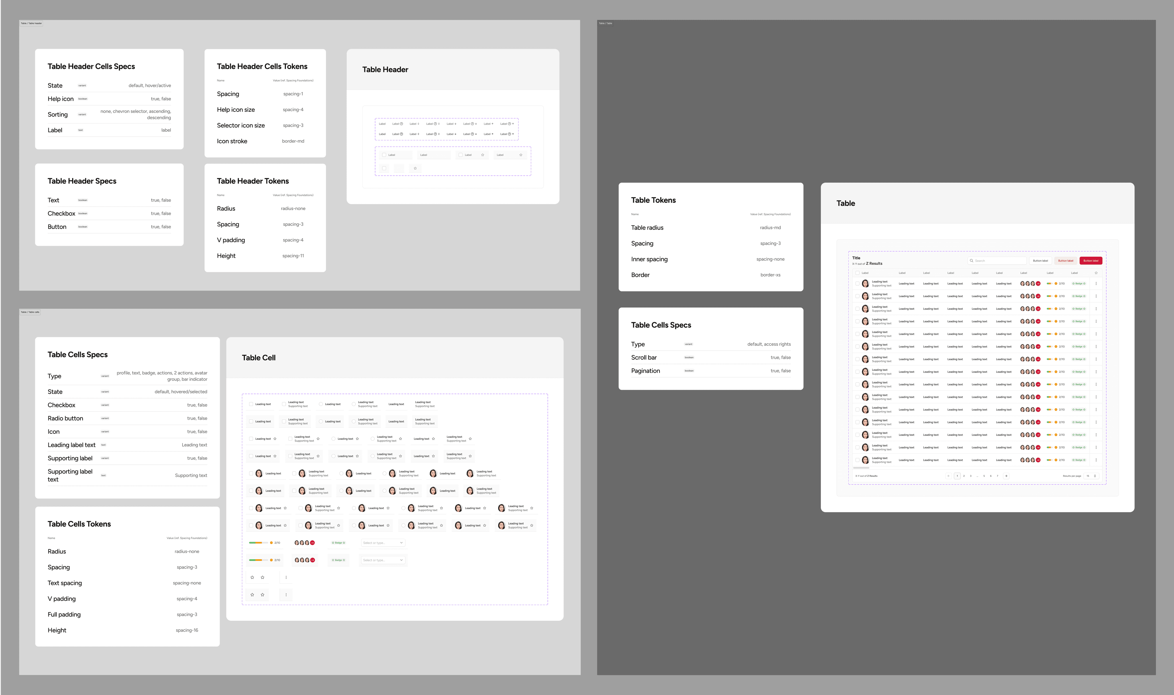
Nested Components
Many UIs repeat the same element across multiple contexts (e.g., a search bar is basically an input field + placeholder text + an icon). By referencing each piece as a sub-component, the design system stays consistent and also minimizes the time it takes to design and develop the components. Changing the base input field automatically updates every derived pattern.
Interactive Prototypes
To help stakeholders visualize how multiple states might feel, I wired up interactive component variants in Figma. Hover, focus, and pressed states are all built into the same asset, so once you drop a button into a prototype, you automatically get realistic micro-interactions. This makes it easier for PMs, devs, and clients to envision real workflows rather than static mockups.
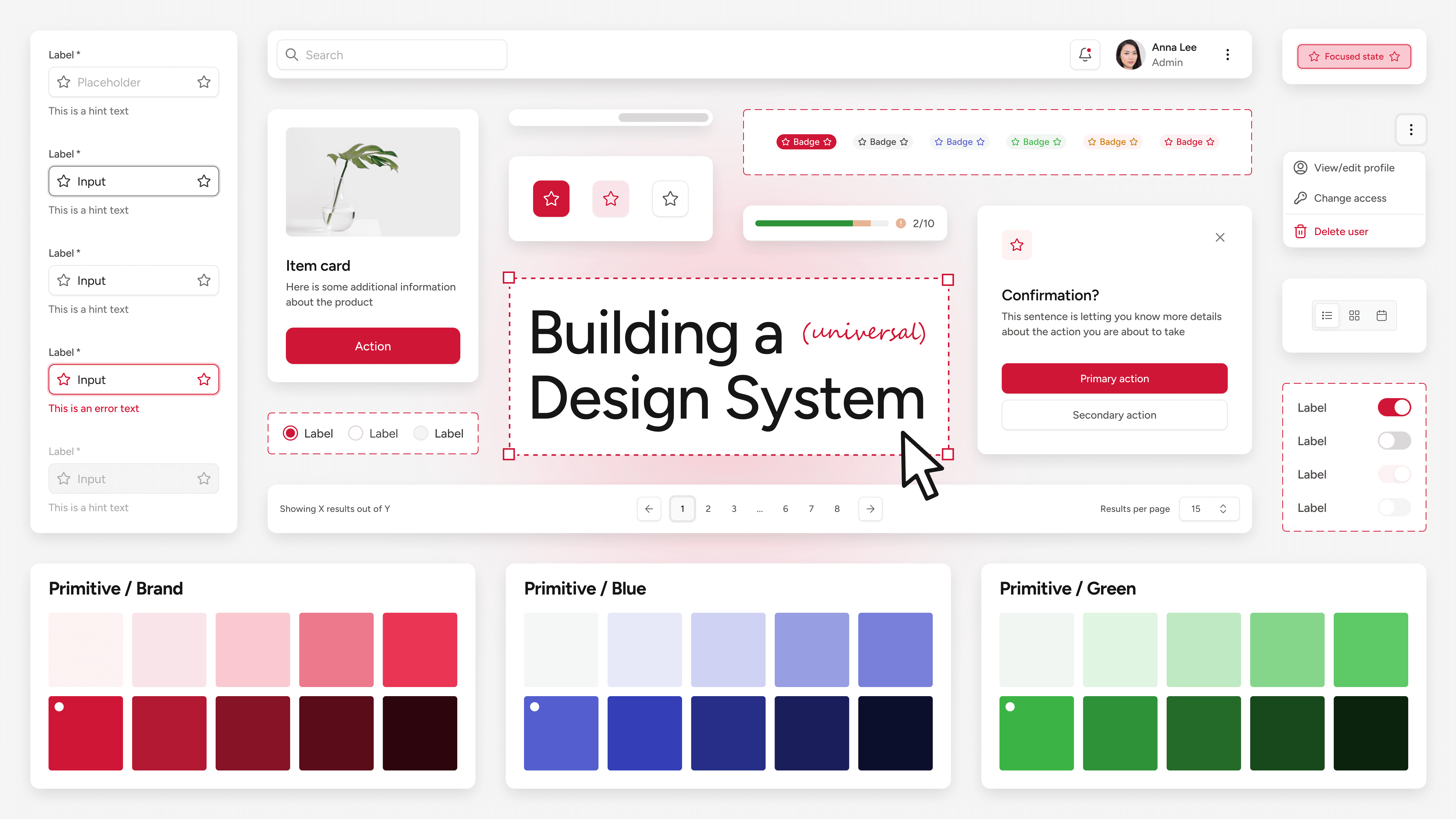
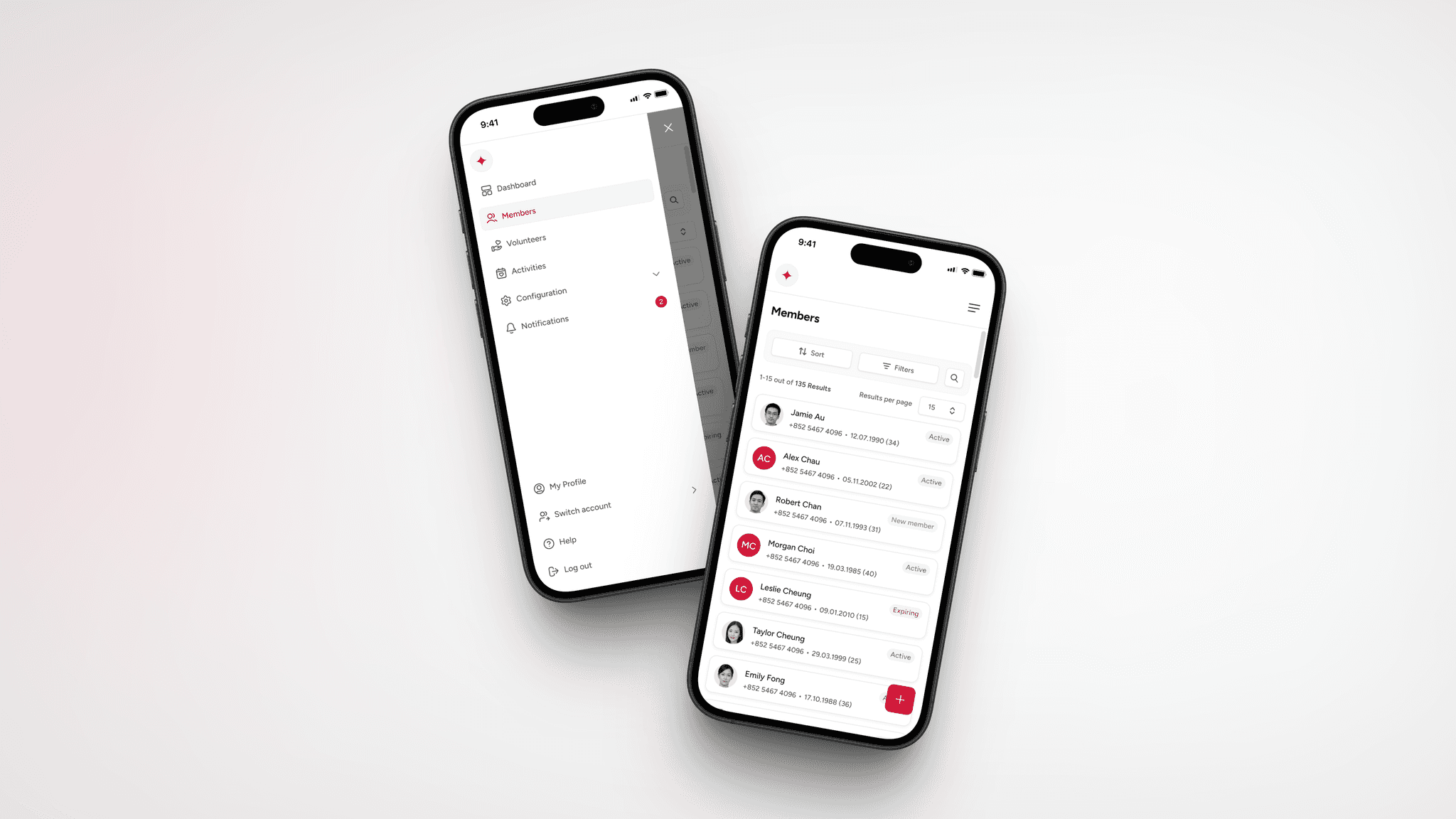
Example Screens
Below are a few screens from a client project that already uses this design system. (Some details have been modified to protect privacy.) They illustrate how tokens, auto-layout, and modular components come together to create a consistent, scalable user experience.

Outcomes

Consistent, Accessible UX
Semantic tokens and modular components ensured a cohesive design language.

Faster Iterations
With strong foundations and modular components, shipping new features takes less tinkering.

Reduced Design-Dev Gap
Documentation for each component (variant specs, booleans, etc.) helps developers build exactly what the design intended.

Scalability
The system was built to grow, supporting new projects and requirements seamlessly.
Future Roadmap

Add More Guidelines
Beyond the current specs, I plan to create “acceptable vs. unacceptable usage” guidelines to help teams avoid design or usability pitfalls—particularly useful for brand-new flows.

QA & Testing
Regular Accessibility Checks: Ensure each new component or feature meets color-contrast and keyboard/focus requirements.
Cross-Browser Validation: Check that tokens/styles degrade gracefully across older browsers or edge cases.
Automated Linting / Visual Regression Tests: Potential next steps to ensure future changes don’t break existing interfaces.

Component Library Expansion
Introducing new components as system requirements evolve / more projects use the system. Possibly adding dark mode or localized variants for local / international clients.
